Thursday, September 29, 2016

Choosing Colors

How often have I held a tube of beads in my hands, of a beautiful or unusual color or finish, and resolve: I am going to make something with you!  And how many times does it not happen?

Sometimes it does work out – where I have a color to start with and I just start matching other tubes with it. Often a color will “pop” against it, or an unexpected pairing will make me go “ooohhh, yeahhh” - which is one of the moments beaders live for.

But generally I find that as much as I want to use this color, these beads, right now, the search frequently winds up in a dead end.  My lesson is: you can’t force a color on yourself. Despite the many challenges bead bloggers make to their readers – make something with orange! Use a color you hate! – it doesn’t work for me.  I want to color outside the lines as much as anyone who has a monster bead stash. Not only aesthetically, but practically I want to use those beads I bought.  But alas, the colors dictate more than I like to admit.

Color tastes change too. When I started out beading I was the Bling Queen. The shinier, the gaudier, the more I liked it. If the beads weren’t silver-lined, I wasn’t interested. I privately referred to this preference as “bordello chic,” though I hasten to add that I have never been in such an establishment so please don’t get any ideas!  I expect it came from watching the marvelous RĂ©gine in “The Seven Per-Cent Solution” as an impressionable young person.

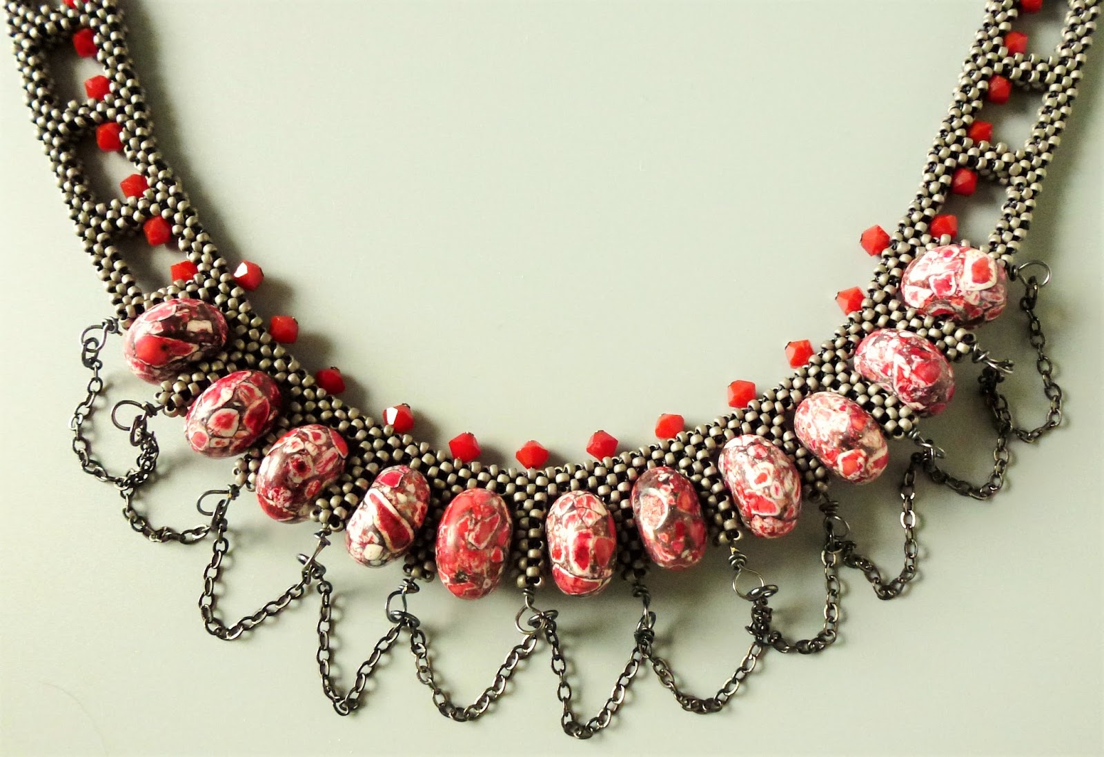
My color preferences have expanded over the years and embraced a somewhat more muted but I like to think more complex palette. This is the result of the Raku Revolution in bead manufacturing – of creating beads that have that amazing finish.   Like these:


Photo from Baubles and Beads

These days I let the focal beads I’m working with do my blinging for me. That also pares down the palette decisions, an added bonus.

To show you what I mean, here’s a piece of embeadery (my term for bead embroidery – check out my Pinterest board under that title) done around a polymer clay cab by Chris Kapono of Mandarin Moon, whose work is largely responsible for the drool marks on my laptop. I wore this piece to a bead show and one of the exhibitors said it looked like a peacock. Hah! No surprise there. Now of course I can’t see anything but the peacock when I look at it. Ah well.

So yes, I still do bling, but with dignity.


Thursday, September 22, 2016

Design Ideas and That Pinterest Board

In an earlier post, I talked about using Pinterest boards to house images of jewelry that I go to for beadwork inspiration – you can check it out here (board) and here (blog).

Today I'm featuring a design that lent itself to being reinterpreted in Cubic Right Angle Weave.  It is a SilverSilk Necklace designed by Hans Bennion, and can be found here.


But once I started beading, the design had its own ideas. 


And, being a beader, I couldn’t leave it unembellished, so I added some cushion cut Swarovski crystals in the center squares.  The color of the middle one is called White Opal Sky Blue and has been discontinued, to my regret. On the other hand, it can result in a little thrill when I come across some still for sale and reflexively hit the “Buy” button.


And you can see again why I like working with pewter gray so much.

Friday, September 16, 2016

Blue Waters

One of the things I resolved to do upon starting a blog was to respond to bead challenges put out there by other bloggers I followed. I’m not very good at keeping deadlines when it comes to beading. Beadwork should ebb and flow and get done when it gets done. Otherwise it becomes beadWORK.

But when a challenge is timely – both in theme and deadline – I found I could do it, and with pleasure.  This would be Love My Art Jewelry’s Caribbean Color Palette Challenge. Sherri Stokey offered a luscious photo to inspire readers:


Only a beader’s heart would beat faster seeing a mess of tubes and strands. And those lurrrrvvely art beads.

One of the things I liked about Sherri’s palette is that it included a color I don’t work with much, white.  I’ve always found it boring and you have to be careful about what color of thread you use with it. White also tends to pop; it’s a muscle color and likes to throw its weight around.

I knew immediately what I wanted to make. I have been doing a lot of bead embroidery this past year, using the new Czech shaped beads that have been blitzing the market: two-hole beads, four-hole beads, triangles, squares, crescents, as well as wild new finishes -  mottled, shiny, matte, you name it.

I found that these shaped beads fit quite snugly around one of my favorite types of cabochons to bead with – Lunasoft cabs. These are made of Lucite with a metallic backing that makes them glow. I also don’t hold with using plastic or acrylic beads in my beadwork, but I make a tremendous exception for them.


I call this “Blue Waters” and kinda wish I was dabbling my toes in the surf on a balmy beach somewhere, now that autumn is flowing in. Just a last taste of summer, please.

Check out what others created over at Love My Art Jewelry, which can be found here.

Thursday, September 8, 2016

Cat Hair

One of the joys of going public with one's beadwork is taking a nice juicy photo which looks great on the viewfinder of your camera, only to get this when you blow it up:


 Cat hair. Yikes!  It showed up even more on the back of the piece:


But how can I have a bead room without a cat in it?  My cats have all been great about my beads and I have woven a bit of them into most everything I make. But you don't want so much of it that you find yourself becoming a weaver of cat hair rather than beads.  One of my rituals on sitting down to bead is to run an Extra Sticky Pet Roller up and down my shirt and over my bead mat. Otherwise I'll spend too much of my evening engaged in the beading equivalent of picking corn silk out of my teeth.

I realize that cat photos on the internet are as trite as glitter-spouting .gifs but thought I would share some today. My furry guy loves to leap up on my beading lap desk and investigate what I'm working on and here he is checking out a Japanese ribbon embroidery bracelet I made from a class I took with Sherry Serafini at Bead Soup in Savage, Maryland.


Those are my stockinged feet down there.


That’s right, eat that shibori ribbon and throw it up on the carpet later, good boy.

Thursday, September 1, 2016

Urban Chic

My color palette tends towards turquoise, purple, chartreuse, with gold and copper. But I have a thing for pewter grey. It works well with bright warm colors like orange and red. Here is a design I created to make use (yet again) of some big beads I fell in love with. I found these at a bead show and they seem to be a compound of pressed and polished glass or gem fragments and are known as mosaic beads. I don't see them much anymore so if anyone knows where to buy them I'd be interested.

What to do with them? Cubic Right Angle Weave to the rescue!


Prior to designing this necklace I had taken a wireworking class with Deryn Mentock called "Link Love" at Art Bliss so I was exploring wire more and you can see that I found a way to work that in here. I call this piece "Chain Link."